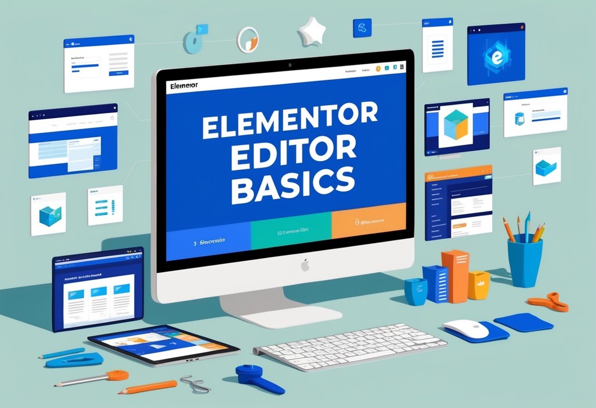
[02] Elementor Editor Basics
Welcome to another step forward in building your website with Elementor. Today, you will explore the Elementor editor, a handy tool that is vital for crafting every part of your site. This lesson will guide you through the basics of the editor, giving you the foundation to start designing a professional-looking website.
Once you access the Elementor editor, the screen is divided into two sections. The right side displays the page content. Here, you can add and change various elements on your page. On the left, the Elementor panel offers you useful widgets for your design, like text, images, and videos. This straightforward layout will make it easier for you to build, customise, and perfect your website's design.
Key Takeaways
- Discover Elementor's user-friendly editor interface
- Use widgets for building and editing your site
- Learn the basic framework for designing pages
Using Elementor Editor
To start using the Elementor Editor, head to the WordPress dashboard. Look for the Pages section and find the home page you created earlier. Click on Edit with Elementor to open the editor.
The Elementor Editor has two main areas. On the right, you'll see the content area. This is where your page design takes shape. You can add and adjust elements here to get the look you want. On the left is the Elementor panel. This has widgets like headings, text editors, and images. You can access widgets quickly by clicking the widget icon at the top of the panel.
The panel header also includes a hamburger menu. From here, you can access Site Settings for global changes or explore other navigation options. Another feature is the Finder, activated with command or control + E, which helps you move around your site easily.
At the bottom toolbar, there are tools for editing your page’s name and layout. You might want to toggle Hide Title to remove the page's title. Use the Navigator to view your page elements, though it will be empty until you start adding content.
For changes, the Edit History allows you to see or backtrack changes, and the responsive mode lets you adjust the view for different devices. When everything looks good, simply click the Update button to save your changes. If you wish to start fresh, you can design from scratch or use a pre-made template. Once connected to your Elementor account, enjoy access to a variety of blocks and templates to enhance your page.
Elementor’s building blocks include sections, columns, and widgets. Sections are surrounded by a blue border, containing columns marked by black dashed borders. Within these columns, you find widgets like text and buttons. Use handles to move and edit these elements. Simply right-click to access more options like duplicate and delete.
When creating new sections, click the plus icon and choose a preset structure. With sections, columns, and widgets, adjust them to fit your design needs using the layout, style, and advanced tabs in the panel. Now you're ready to build and customise your pages with ease.
Grasping the Elementor Interface
Page Area and Editor Panel
When you access the Elementor editor, the main section you'll notice is divided into two parts. On the right side is your page area. This is where you can add and adjust elements like text or images to create the look and feel of your website. On the left, you will find the editor panel. This is where the creative tools, or widgets, live. Widgets help you add various elements to your site. To add a widget, click on the icon that opens the widget library.
Panel Header and Widget Accessibility
At the top of the editor panel is the panel header. To the left of this header, you will find a menu icon. This menu gives you different settings and options for navigation. Here, you can find your site settings, which allow you to set global styles. There is also an option for user preferences. This lets you change the look of the Elementor interface, such as enabling dark mode.
Editor Preferences
The editor hosts several features to enhance your building experience. One handy feature is the page settings, where you can change the page name and layout. You can also hide the page title here. Another useful tool is the navigator, which displays the layout of your page elements in a structured way, although it will be empty until you start adding content. The toolbar at the bottom also contains tools for viewing the edit history or changing the screen size for responsive design adjustments.
The Quick Access Tool
The finder is a powerful search tool for quick navigation around your site. You can activate it by pressing Command or Control + E on your keyboard. This tool allows you to swiftly jump to any part of your site, making it easier to manage and edit your pages without leaving the editor.
Discovering Features of the Editor
Toolbar Panel Tools
The toolbar at the bottom of the page in the editor contains important tools. Page Settings allows you to change the page's title and layout. If needed, you can hide the title that appears at the top of your page. The Navigator is handy for organising your page elements; access it by clicking an icon or using the shortcut Command or Control + I. The Edit History lets you view recent changes or go back to previous versions of your work.
Adapting to Different Devices and Saving Edits
Switch to Responsive Mode using the icon in the toolbar to see how your page appears on various screen sizes. This mode is perfect for making adjustments to ensure everything looks great across all devices. Once you’re happy with your edits, press the Update button to save and publish your changes. There are other saving options, which will be discussed later in the course.
Creating Pages with Elementor
Using Templates from the Collection
To start building your page, you can explore a range of pre-designed blocks and pages. These templates allow you to easily insert well-crafted sections into your page. Simply search for categories or use the search bar to find specific elements. Once you choose what you need, add it to your favourites for easier access later. After making your selection, insert the block to see it in action on your page.
Linking to the Elementor Collection
Before you access templates for the first time, it's important to connect your Elementor account. This can be done with an existing account or by creating a new free one. Once connected, you can seamlessly add and use the templates, enhancing your design process with pre-built sections and ideas.
Overview of Changing Elementor's Structure
Managing the Building Blocks
Elementor uses three main building blocks: sections, columns, and widgets. Sections are the largest, noticeable by their blue border. Inside sections, you'll find columns outlined with a black dashed border. Widgets like text and buttons fit inside these columns. You control their position and appearance with their handles.
Modifying, Copying, and Removing
To change a section, column, or widget, right-click its handle. A menu will appear, letting you edit, copy, or remove the item. This is handy for keeping your design clean and organised.
Moving Elements Around
You can easily move sections, columns, and widgets by dragging and dropping them. When you drag an element, a blue line shows where it will land when you release it. This feature makes it simple to try different layouts.
Creating and Adjusting Layout Options
To add new sections, click the plus icon. Choose from preset designs and adjust them as needed. You can also remove them if they don't fit your design. Each section, column, and widget has three tabs for settings: Sections and columns use layout, style, and advanced tabs, while widgets have content, style, and advanced tabs. These help you shape your page’s design.
Design System Setup for Next Lesson
To prepare for the upcoming lesson, you'll need to set up your design system. This involves organising and structuring how you want your website to look and feel. By doing this, you ensure your website has a consistent style throughout. Here’s a quick guide to help you get started.
1. Setting Global Styles:
Use the site settings to define global styles like colours, fonts, and typography. This will make sure that all your pages have the same look without needing to adjust each element individually.
2. Choosing and Customising Templates:
You can choose from a variety of pre-designed templates in the Elementor library. These templates can save you time, and you can customise them to fit your needs. Remember, you can add these templates to your favourites for quicker access next time.
3. Understanding Building Blocks:
Familiarity with sections, columns, and widgets is key. Sections are your largest building blocks, columns fit within sections, and widgets such as text or buttons go into columns. Knowing how to control these elements using handles will help you manage your layout better.
4. Using Responsive Design:
Make sure your design looks great on all device sizes. Use the responsive mode to switch between different screen views, ensuring that your design maintains its integrity on both mobile and desktop devices.
By following these steps, you will set up a solid foundation for your design system. This will help streamline your work and maintain a cohesive design throughout your website.